Why our new logo underlines the intro
Nicole Adams · November 6, 2026 · 9 min read
Introzy has a new logo. It's "Intro" in ink, with a violet zy whose tail runs back underneath the whole word, and each part of it says something about what we do.
If you run a referral program, you've probably had a partner text you "hey, any news on that intro?" and realized you didn't have an answer. That moment is the reason Introzy exists, and the new logo is built around it: every intro should end in something you can underline.
Where we started: a name, typed
This is Introzy's fourth look. Our first logo looked a lot like our parent brand, Sanguine. Then we went hyper colorful. Then, with v4, we stripped it all the way back to plain text: "Introzy" in Inter, no favicon. v5 is the first one built around what the product does.
What v4 did give us was a solid foundation: warm neutrals, one violet accent, one thin border, no gradients or shadows. With that in place, the logo could carry the story.
| Area | v4 | v5 |
|---|---|---|
| Logo | "Introzy" typed in Inter | The bottom-line logo, a drawing |
| Favicon | None | A check resting on the violet line |
| Text face | Inter | Manrope 400 and 600 |
| Engineering mark | None | Green zy and line, engineering content only |
How we think about design
Before we drew anything, we agreed on a few rules. These rules are used to shape the logo, but we also use them in everything else we make that ties to our brand identity.
Our customers trust us with their partner relationships, their data, and their payouts, so software about money should feel warm and safe. That rules out a clinical look, and it rules out anything too playful. We aim for calm with a little warmth.
How a product looks shapes whether people trust it, and they decide fast. In Stanford's web credibility research, "design look" came up in 46.1% of people's comments about whether a site was credible (Consumer WebWatch, 2002). Another study found people judge a page's visual appeal in about 50 milliseconds, and those snap ratings held up after a longer look (Lindgaard et al., 2006).
We use color to carry meaning. The one violet goes on things you can click. The softer pastels each stand for something: violet for Kai, green for money, blue for the pipelines, and teal for your network.
Personality shows up in a few chosen places: rounded buttons, small moments of copy ("Your partners will text you less. That's the point.") and motion that plays once when you do something. The rest of the interface stays quiet.
Our pictures are real product screens, because the most interesting thing we can show you is a real deal getting attributed and a real commission getting paid. You won't see stock photos or random 3D shapes from us.
And every piece has to earn its spot. We held the logo to that: if a stroke didn't mean something, we cut it.
Brands that hide a story in their mark
The logos we admire most have one idea built into the shape, and they never explain it. Once you notice it, it sticks. A few we kept coming back to:
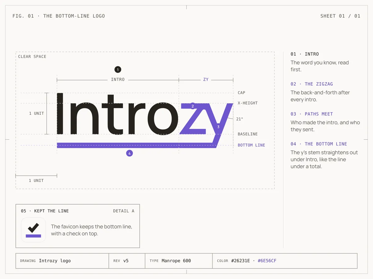
Adidas. Dassler called Adidas "the three stripe company," and the stripes have been on its shoes since 1949. The three-bar mark later turned the stripes into a shape that a lot of people read as a mountain to climb. We loved how often that logo gets broken down and annotated, and our own construction sheet borrows that format. (source)
FedEx. In 1994, Lindon Leader at Landor drew the FedEx wordmark with an arrow hiding in the space between the E and the x. It wasn't even the plan. It showed up after hundreds of versions, and it says "from here to there, on time." (source)
Amazon. Turner Duckworth, briefed by Jeff Bezos in 1998, turned Amazon's plain line into a curved arrow running from the a to the z. It reads as a smile first, then as a promise: everything, from A to Z. (source)
What we took from them: the idea should live inside the letters, the way the FedEx arrow and the Amazon smile do, and our bottom line works the same way. The logo also has to look good to someone who never reads this post, so the meaning is a bonus. And the shape should match the work. We turn intros into results, so our line runs from the intro to the outcome.
There's research behind that last point. Across six studies and a sample of 597 brands, logos that show what a company does raised brand evaluations and purchase intent, and the lift was biggest for brands people didn't know yet (Luffarelli, Mukesh and Mahmood, Journal of Marketing Research, 2019; HBR summary). Even a logo's basic shape changes what people expect from a company: rounder logos read as softer, angular ones as harder and more durable (Jiang et al., Journal of Consumer Research, 2016).
Reading the logo, left to right
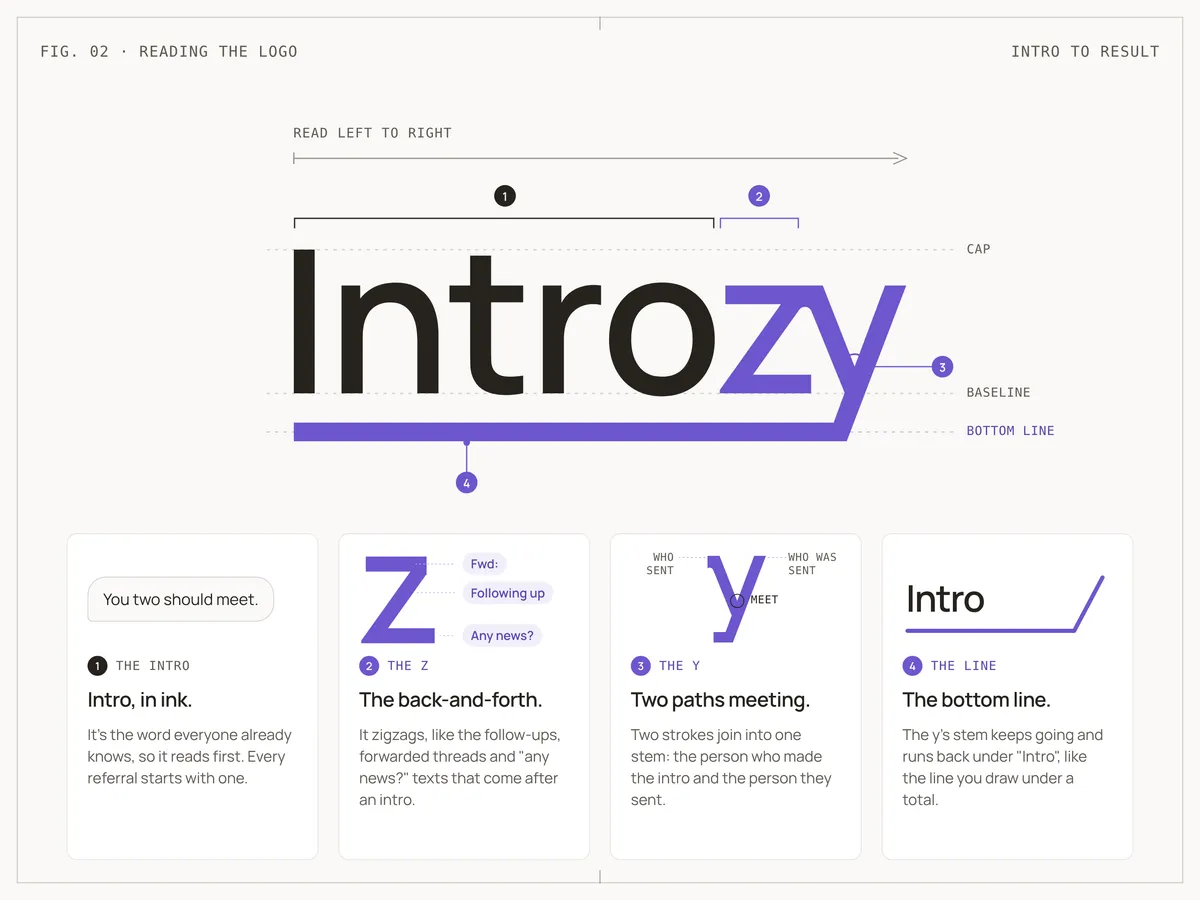
The logo reads in the same order a referral actually happens.
- Intro, in ink. It's the word everyone already knows, so it reads first. Every referral starts with one.
- The z is the back-and-forth. It zigzags, like the follow-ups, forwarded threads and "any news?" texts that come after an intro.
- The y is two paths meeting. Two strokes join into one stem: the person who made the intro and the person they sent.
- The bottom line. The y's stem keeps going, straightens out and runs back under "Intro", like the line you draw under a total.
It's all one continuous violet shape. The mess straightens out into a result, and the result sits right under the intro that started it.
The favicon: a check on the line
A browser tab is too small for the full logo, so the favicon keeps the part that matters most: the violet bottom line, with a simple check on top.
Everyone reads a check as "done." Sitting on the bottom line, it means the intro landed.
Why just a wordmark and a favicon
Most logos fall into a few structures. We looked at each one before landing on a wordmark plus a favicon.
| Structure | What it is | Why we passed |
|---|---|---|
| Symbol or icon | A standalone shape, like a swoosh | A new shape means nothing until you spend years teaching people what it stands for |
| Combination mark | A symbol sitting next to the name | Two things competing for attention, and one of them still needs explaining |
| Lettermark | Initials or a single letter | "I" or "IZ" throws away the one word people already understand |
| Emblem | The name inside a badge or crest | Feels formal and heavy, and falls apart at small sizes |
| Mascot | A character that represents the brand | We're developing and testing a mascot for Kai, our AI feature, not the whole product. The logo shouldn't compete with it |
We chose a wordmark for three reasons. Our name already does half the work, since "Intro" is right there in it. People get what we're about before they've seen a single screen, so the logo's job is to make that word land.
We're also still building name recognition. While people are learning who we are, every look at the logo should teach them the name, and a separate symbol would split that attention.
Marketing research backs this up. A symbol with no built-in meaning only picks one up by appearing next to the company name again and again, which takes heavier use and more investment (Henderson and Cote, Journal of Marketing, 1998).
And the meaning fits inside the letters. The zigzag, the meeting point and the bottom line are all part of the word, so we didn't need an extra shape.
A wordmark does struggle in tiny spaces, like a browser tab or an app icon. That's what the favicon is for: the bottom line pulled out of the wordmark, with a check on top, so even at 16 pixels it's clearly us.
Why we switched to Manrope
The logo is drawn from Manrope, an open-source typeface Mikhail Sharanda designed in 2018, so we made Manrope our everyday font too, replacing Inter.
Now the logo and the words next to it share the same shapes, so the logo never looks pasted on. We still never type it out, though. It's a drawing, and the zy and its line don't exist in any font.
We kept the weights light, nothing heavier than semibold, so the type stays calm.
What we didn't change
v5 is a new identity on the same foundation. A few things stayed exactly as they were:
- Warm off-white backgrounds and a warm near-black, never pure black.
- One violet accent, saved for buttons and links.
- No gradients, shadows or glows.
- Real product screens instead of illustrations or stock photos.
People trust Introzy with their partner relationships and their payouts. Keeping the look steady is part of earning that. Usability research says the same: when an interface works the way people expect, it builds their confidence and cuts confusion (Nielsen Norman Group).
How we protect it
A logo with a meaning only works if nobody messes with it, so we keep the rules short:
- Leave clear space around it equal to the height of the I.
- Don't use it smaller than 100 pixels wide.
- Don't recolor it, stretch it, retype it or add effects.
- Don't separate the zy from "Intro" or change the length of the bottom line. Its length is part of the meaning.
There are versions for light backgrounds, dark backgrounds, one-color print and white-on-photo, plus a green one we only use on engineering posts.
How we built it with Claude Design
v5 came together right as we changed how we do marketing. We brought design in-house and made LinkedIn our main channel, so we needed brand assets we could make, tweak and ship ourselves, fast.
Our whole design system lives in Claude Design: colors, type, components, logo files and the rules for using them. New work starts from it, so a LinkedIn post, a slide and a landing page all get the same violet, font and logo.
The visuals for this post came out of the same workflow. We laid out the anatomy, the before-and-after and the construction sheet on one canvas, revised them by talking through changes, and resized the final graphic for mobile in a few minutes.
We move faster now. A copy or layout change takes a sentence, and new work starts on brand, so there's less to fix in review.
Where you'll see it
The new logo and favicon are already live on introzy.com and in the app, so if you've logged in lately, you've probably spotted the check in your tab.
Every intro should get a bottom line, and that's the job of the product too: it tracks every referral from intro to payout, so the next "any news?" text already has an answer. Thanks for being here.
Stop reading about referrals. Start tracking them.
Free up to 5 referrals a month. Every feature included. No card to start.